Shopify App | Documentation
CI Upload - Files & Images

- Version: 1.2.2
- Author: CynoInfotech Team
- Published: 6 May, 2025
- Last Update: 30 September, 2026
If you have any questions beyond the scope of this guide, feel free to email us at info@cynoinfotech.com.
Information
To enhance the shopping experience on an eCommerce store, allowing customers to upload files or images during the product selection process can be a game-changer. Whether it's for custom printing, documentation submission, or design input, the Upload Files & Images App enables seamless file uploads directly from the product page — eliminating the need for follow-up emails or external communication.
This app is especially useful for merchants offering customized products such as printed merchandise, gift items, photo frames, keychains, or any product that requires additional customer input. Customers can upload photos, documents, or artwork while placing the order, crop images to the exact shape or ratio you need, and see their uploads as thumbnails right in the cart.
Store admins have full control over file types, size limits, image dimensions and minimum file counts, and can even charge for uploads by adding a Flat Rate, Per File or File Count Range price to the product in the cart. Uploaded files are linked with each specific order, can be stored in Shopify Files or your own Dropbox account, and can be reviewed, filtered, exported to CSV or downloaded in bulk as a ZIP archive.
This app improves store functionality by:
- Reducing manual communication for collecting images or files.
- Preventing order delays due to missing or unsuitable uploads.
- Ensuring that every order is complete at the time of purchase.
- Turning file uploads into an additional revenue source with upload pricing.
By simplifying the file submission process, this app not only saves time for customers and store owners but also improves customer satisfaction and trust in the customization process. It’s the ideal solution for any store that deals in personalized or document-based products.
Key Features
- 1Seamless file and image upload on product pages, including Featured Product and Quick View blocks.
- 2Multiple file types supported, with file size limit control.
- 3Dropzone or compact button upload style, with a library of 20 upload icons and icon position control.
- 4Customizable field label, help text, note field and error messages.
- 5Image Cropping — free crop, circle crop, or merchant-defined aspect ratios (also per variant).
- 6Restrict image dimensions and set a minimum file count, globally or per variant.
- 7Upload Pricing — Flat Rate, Per File or File Count Range charges added to the product price in the cart.
- 8Uploader Rules for specific products/collections with priority ordering, including per-rule upload prices.
- 9Store files in Shopify Files or your own Dropbox account.
- 10File Rename on download using product name, variant, order number, quantity and date.
- 11Uploaded Files page with search, filters and sorting, plus bulk ZIP download and CSV export.
- 12File access in the order dashboard, cart thumbnails, and a fully responsive layout.
Enable App
Use the Setup Guide on the app dashboard to enable the CI Upload Files & Images app on your storefront.
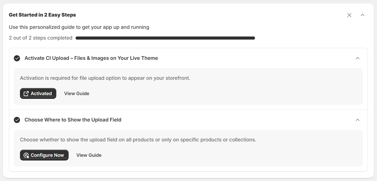
To make CI Upload Files & Images work properly on your storefront, app embed must be enabled. Click the Activate App button and click Save in the theme editor to enable it.
Once you've done this, come back to the Setup Guide in the admin and click I have done it. When both steps show as completed, the app is ready to use.
- The Setup Guide tracks your progress with a step counter (e.g., "2 out of 2 steps completed") and a progress bar.
- Activate CI Upload Files & Images on Your Store: Click the Activated button to enable the app embed from your theme editor.
- Configure Now: Guides you to add your settings after activation.
- Click View Guide if you can't understand or need to help for the setup then you can check in this User Guide.
Analytics
The Analytics section on the app dashboard provides an overview of your file uploader's status, product and rule assignments, uploaded files, and current subscription plan.

From this section, you can quickly check the following information:
| Field | Description |
|---|---|
App Status | Check whether the file uploader is active and visible on your online store. |
Applies To | View the products and upload rules configured for your file uploader. Click Configure Now to manage your settings. |
Uploaded Files | View the total number of files uploaded by your customers. Click View Files to access uploaded files. |
Current Plan | Check your current subscription plan. Click Manage Plan to view or manage your plan. |
Widget Position
You can set position anywhere in the Product Information from Product Page. Also, you can check visible in Quick View option.

If you'd like to display it elsewhere on the product page, you can reposition it by adding the CI File Uploader app block in your theme editor.
- From your Shopify admin, go to Online Store > Themes.
- Find the theme you want to edit and click Customize.
- Navigate to the product page or section where you want the uploader to appear.
- In the sidebar, click Add block.
- Under the Apps section, select CI File Uploader.
- Position the block where you want it displayed.
- Click Save in the editor to apply the changes.
File Uploader
Use this setting for File uploader general settings and dropzone appearance design settings.
General Settings
Applies To
Select the option where you want the dropzone to appear.
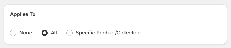
| Option | Description |
|---|---|
All | Show the dropzone on all products. |
Specific Product | Show the dropzone only on the selected products. |
Specific Collection | Show the dropzone only on products in the selected collections. |
None | Hide the dropzone everywhere (for example, to pause the uploader temporarily). |
Upload Field
You can set the dropzone field configure for files.
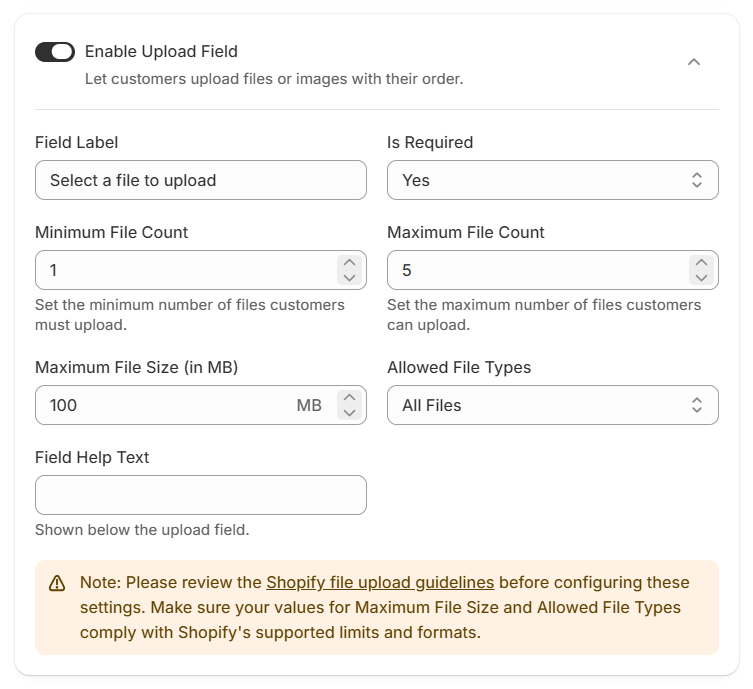
| Field | Type | Description |
|---|---|---|
Enable Upload Field | Toggle | You can configure the Enable/Disable Upload Field for dropzone. |
Field Label | Text | You can add label for dropzone. |
Is Required | Toggle | You can configure if set yes/no for dropzone required. |
Minimum File Count | Number | You can add the minimum count for allowed minimum files. |
Maximum File Count | Number | You can add the maximum count for allowed maximum files. |
Maximum File Size(in MB) | Number | You can add the size for allowed maximum file size. |
Allowed File Types | Select | You can configure the allowed file types for All Files, Images, Video or Specific Files Only.
|
Note Field
You can set the text field settings for note field.
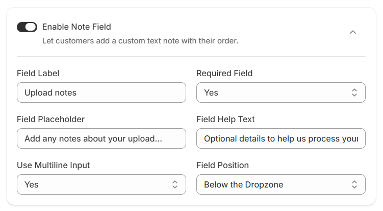
| Field | Type | Description |
|---|---|---|
Enable Note Field | Toggle | You can configure the enable/disable for the note field. |
Field Label | Text | You can change the title for the note field. |
Required Field | Toggle | You can set the option yes/no for the required note field. |
Field Placeholder | Text | You can set the placeholder for the note field. |
Field Help Text | Text | You can set the help text for the note field. |
Use Multiline Input | Toggle | You can set the note field multiline input (as a textarea). |
Field Position | Select | You can set the note field position below or above on dropzone. |
Appearance
Design the dropzone as your theme with Upload Style Dropzone or Button using Text or Button Styling, Box or Button Styling and Icon Settings.
Dropzone Upload Styling
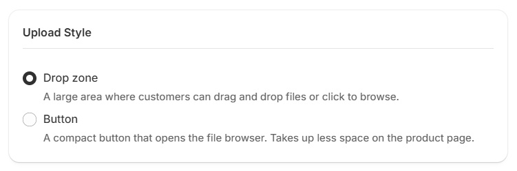
You can choose the Dropzone or Button as per required.
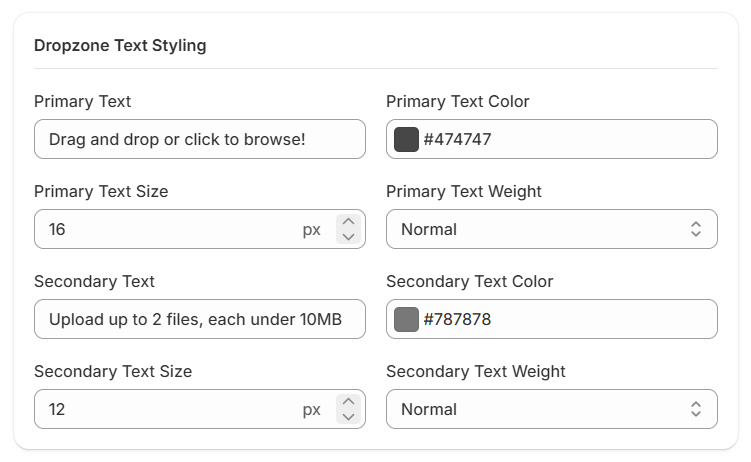
Dropzone Text Styling
The Dropzone Text Styling section allows you to customize the text displayed in the file upload dropzone on your storefront. You can change the text content, color, size, and font weight for both primary and secondary text to match your store's design.
| Field | Type | Description |
|---|---|---|
Primary Text | Text | Enter the main message displayed in the upload dropzone. For example, "Drag and drop or click to browse!" |
Primary Text Color | Color | Set the color of the primary text using a color picker or a HEX color value. |
Primary Text Size | Number | Set the font size of the primary text in pixels (px). |
Primary Text Weight | Select | Choose the font weight for the primary text, such as Normal or other available options. |
Secondary Text | Text | Enter additional information displayed below the primary text. For example, "Upload up to 2 files, each under 10MB". |
Secondary Text Color | Color | Set the color of the secondary text using a color picker or a HEX color value. |
Secondary Text Size | Number | Set the font size of the secondary text in pixels (px). |
Secondary Text Weight | Select | Choose the font weight for the secondary text. |
Box Styling
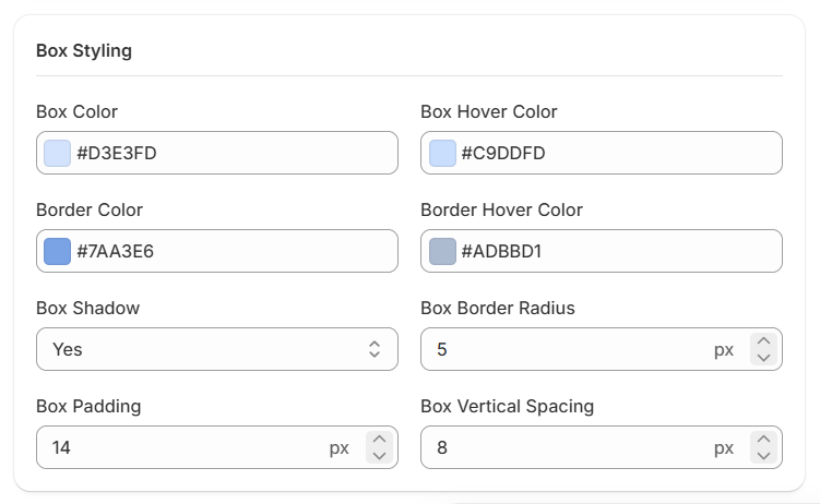
The Box Styling section allows you to customize the appearance of the file upload dropzone on your storefront. You can adjust the background colors, border colors, shadow, corner radius, padding, and vertical spacing to match your store's design.
| Field | Type | Description |
|---|---|---|
Box Color | Color | Set the default background color of the upload dropzone using a color picker or HEX color value. |
Box Hover Color | Color | Set the background color displayed when customers hover over the upload dropzone. |
Border Color | Color | Set the default border color of the upload dropzone. |
Border Hover Color | Color | Set the border color displayed when customers hover over the upload dropzone. |
Box Shadow | Toggle | Enable or disable the shadow around the upload dropzone. |
Box Border Radius | Number | Set the roundness of the dropzone's corners in pixels (px). |
Box Padding | Number | Adjust the inner spacing between the dropzone's border and its content in pixels (px). |
Box Vertical Spacing | Number | Set the vertical spacing around the upload dropzone in pixels (px). |
Dropzone Show Icon
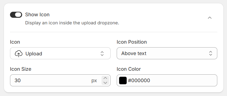
The Show Icon setting allows you to display an icon inside the file upload dropzone on your storefront. You can enable or disable the icon and customize its type, position, size, and color to match your store's design.
| Field | Type | Description |
|---|---|---|
Show Icon | Toggle | Enable or disable the display of an icon inside the upload dropzone. |
Icon | Select | Select the icon you want to display, such as the Upload icon. |
Icon Position | Select | Choose how the icon appears in relation to the dropzone text:
|
Icon Size | Number | Set the icon's size in pixels (px). |
Icon Color | Color | Set the icon color using a color picker or HEX color value. |
Button Text Styling
The Button Text Styling section allows you to customize the text and typography of the upload button displayed in the file upload dropzone on your storefront. You can change the button label, font size, text colors, and font weight to match your store's design.
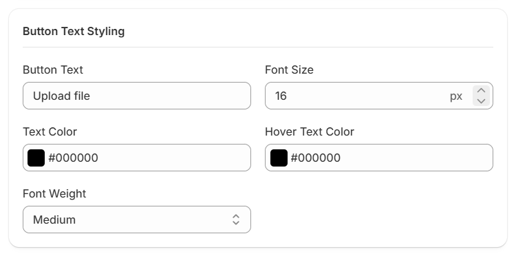
| Field | Type | Description |
|---|---|---|
Button Text | Text | Customize the label displayed on the upload button. For example, "Upload file." |
Font Size | Number | Set the button text size in pixels (px). |
Text Color | Color | Set the default text color of the upload button using a color picker or HEX color value. |
Hover Text Color | Color | Set the text color displayed when customers hover over the upload button. |
Font Weight | Select | Choose the font weight of the button text, such as Medium or other available options. |
Button Styling
The Button Styling section allows you to customize the appearance and layout of the upload button displayed in the file upload dropzone on your storefront. You can adjust the button width, alignment, size, colors, border, and corner radius to match your store's design.
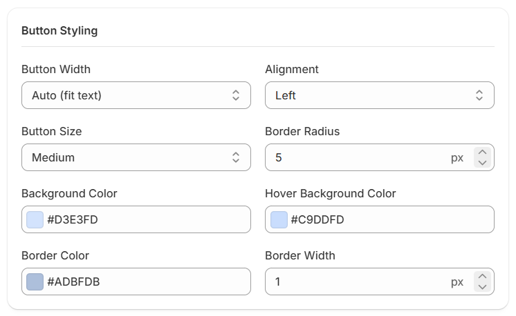
| Field | Type | Description |
|---|---|---|
Button Width | Select | Choose the width of the upload button, such as Auto (fit text) or other available width options. |
Alignment | Select | Set the button's alignment within the upload dropzone, such as Left, Center, or Right. |
Button Size | Select | Select the button size to control its overall appearance, such as Small, Medium, or other available sizes. |
Border Radius | Number | Set the roundness of the button's corners in pixels (px). |
Background Color | Color | Set the default background color of the upload button using a color picker or HEX color value. |
Hover Background Color | Color | Set the background color displayed when customers hover over the upload button. |
Border Color | Color | Set the color of the upload button's border. |
Border Width | Number | Set the thickness of the upload button's border in pixels (px). |
Button Show Icon
The Show Icon setting allows you to display an icon inside the upload button on your storefront. You can enable or disable the icon and customize its type, position, size, and color to match your store's design.
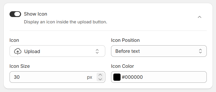
| Field | Type | Description |
|---|---|---|
Show Icon | Toggle | Enable or disable the display of an icon inside the upload button. |
Icon | Select | Select the icon you want to display, such as the Upload icon. |
Icon Position | Select | Choose where the icon appears in relation to the button text:
|
Icon Size | Number | Set the icon's size in pixels (px). |
Icon Color | Color | Set the icon color using a color picker or HEX color value. |
Label Styling
The Label Styling section allows you to customize the appearance of the upload field label displayed on your storefront. You can adjust the label color, font size, and font weight to match your store's design and maintain a consistent appearance across your product pages.
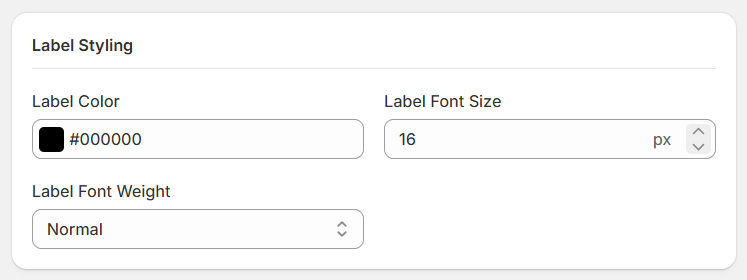
| Field | Type | Description |
|---|---|---|
Label Color | Color | Set the color of the upload field label using a color picker or HEX color value. |
Label Font Size | Number | Set the label text size in pixels (px). |
Label Font Weight | Select | Choose the font weight of the label, such as Normal or other available options. |
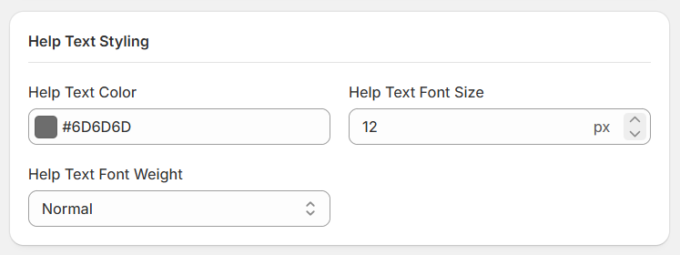
Help Text Styling
The Help Text Styling section allows you to customize the appearance of the help text displayed around the file upload field on your storefront. You can adjust the text color, font size, and font weight to make additional instructions clear and consistent with your store's design.
| Field | Type | Description |
|---|---|---|
Help Text Color | Color | Set the color of the help text using a color picker or HEX color value. |
Help Text Font Size | Number | Set the help text size in pixels (px). |
Help Text Font Weight | Select | Choose the font weight of the help text, such as Normal or other available options. |
Advanced Settings
The Add Price to Uploads feature allows you to charge customers an additional amount when they upload files through the upload field on your storefront. The additional charge is added to the product's price in the cart.
Add price to uploads
Enable Add price to uploads to configure upload pricing. You can choose from three pricing types: Flat Rate, Per File, and File Count Range.
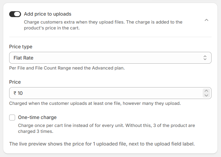
Enable Add Price to Uploads
Turn on this setting to charge customers an additional amount for their uploads. Turn it off if you do not want to apply an extra upload charge.
Price Type
Choose how the additional upload charge is calculated.
Flat Rate
Charge a fixed amount when a customer uploads at least one file, regardless of how many files they upload.
- Price: Enter the fixed amount to charge.
- The charge applies when the customer uploads one or more files, regardless of the total number of uploaded files.
Example: If the price is ₹10, the customer is charged ₹10 whether they upload one file or multiple files.
Per File
Charge customers for each file they upload.
- Price per File: Enter the amount to charge for each uploaded file.
- The charge is multiplied by the number of files uploaded.
Example: If the price per file is ₹10 and the customer uploads 3 files, the additional charge is ₹30.
File Count Range
Set different prices based on the number of files a customer uploads. You can create multiple ranges to apply different charges to different upload quantities.
- Min files: Enter the minimum number of files for the range.
- Max files: Enter the maximum number of files for the range. Leave the maximum blank for the final range if there is no upper limit.
- Price: Enter the charge for that file-count range.
- Add range: Click this button to add another pricing range.
- Use the delete icon to remove a range you no longer need.
Each range starts immediately after the previous range ends. Configure your ranges in order to cover the intended file counts without gaps or overlaps.
Example:
| Number of uploaded files | Additional charge |
|---|---|
| 1–2 files | ₹10 |
| 3–5 files | ₹20 |
| 6 or more files | ₹30 |
One-Time Charge
Enable One-time charge to charge once per cart line instead of charging separately for every product unit.
When this setting is disabled, the upload charge is applied for each product unit. For example, if the customer purchases 3 units, the charge may be applied 3 times.
When enabled, the charge is applied only once per cart line, regardless of the product quantity.
Image Cropping
The Image Cropping feature allows customers to crop their images before uploading them to your store. Enable this feature to let customers adjust their images according to your preferred cropping mode.
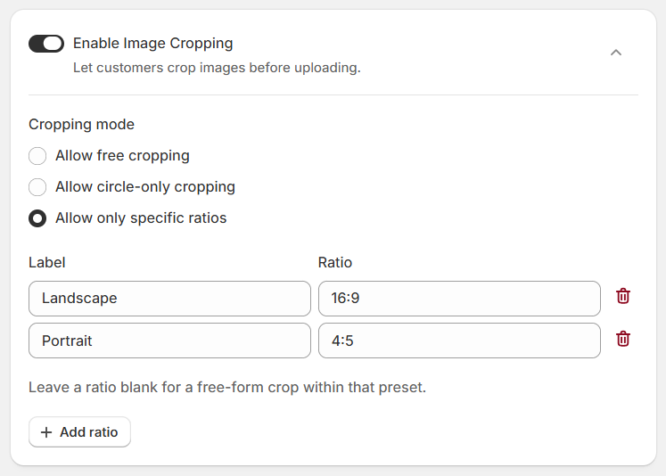
Enable Image Cropping
Turn on Enable Image Cropping to allow customers to crop images before uploading them. When enabled, you can choose the cropping mode that best suits your products.
Cropping Mode
Choose one of the following cropping modes:
| Mode | Description |
|---|---|
Allow free cropping | Allows customers to crop images freely without being restricted to a predefined aspect ratio. |
Allow circle-only cropping | Allows customers to crop images into a circular shape. Useful for keychains, badges, profile photo products, and other circular designs. |
Allow only specific ratios | Restricts customers to the aspect ratios you configure. You can add multiple cropping presets for different image formats or product requirements. |
When you select this mode, the following settings are available:
| Field | Description |
|---|---|
Label | Enter a name for each cropping preset, such as Landscape or Portrait. Customers can use these labels to identify the available cropping options. |
Ratio | Enter the aspect ratio for each preset, such as 16:9 for Landscape or 4:5 for Portrait. |
Add ratio | Click this button to add another cropping preset. |
Delete | Click the delete icon to remove a preset you no longer need. |
Example Configuration:
| Label | Ratio | Purpose |
|---|---|---|
| Landscape | 16:9 | Wide images and banners |
| Portrait | 4:5 | Portrait photos and product images |
| Square | 1:1 | Square product images and profile photos |
These are example presets. Configure the labels and ratios according to your product requirements.
File Restrictions
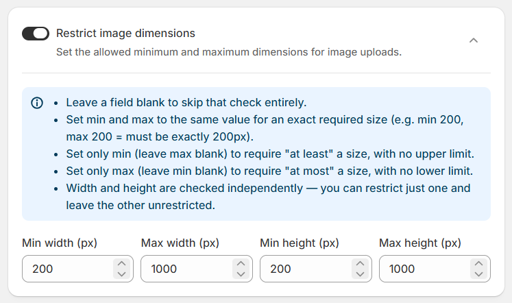
You can set the minimum and maximum dimensions for image uploads.
| Field | Type | Description |
|---|---|---|
Restrict Image Dimensions | Toggle | Enable or disable image dimension restrictions for uploaded images. |
Min Width (px) | Number | Set the minimum allowed image width in pixels. Leave blank to skip the minimum width check. |
Max Width (px) | Number | Set the maximum allowed image width in pixels. Leave blank to skip the maximum width check. |
Min Height (px) | Number | Set the minimum allowed image height in pixels. Leave blank to skip the minimum height check. |
Max Height (px) | Number | Set the maximum allowed image height in pixels. Leave blank to skip the maximum height check. |
- Exact dimensions: Set the minimum and maximum values to the same number if you require an exact dimension. For example, set Min Width to 200 and Max Width to 200 to require a width of exactly 200 pixels.
- Minimum only: Set only the minimum value to require a minimum size without an upper limit.
- Maximum only: Set only the maximum value to enforce an upper size limit without a minimum.
- Independent checks: Width and height are checked independently, so you can restrict one dimension while leaving the other unrestricted.
Uploader Rules
Read the three points below to understand how Uploader Rules work.
What Are Uploader Rules?
Why Use Rules?
- Some products may require two images, others only one.
- Some products may require PDF uploads only.
- Some collections may require notes or text fields.
- Some products may hide the uploader completely.
How Rule Priority Works
- Priority 1 → Custom T-Shirts (strict upload rules)
- Priority 5 → All Clothing (basic upload rules)
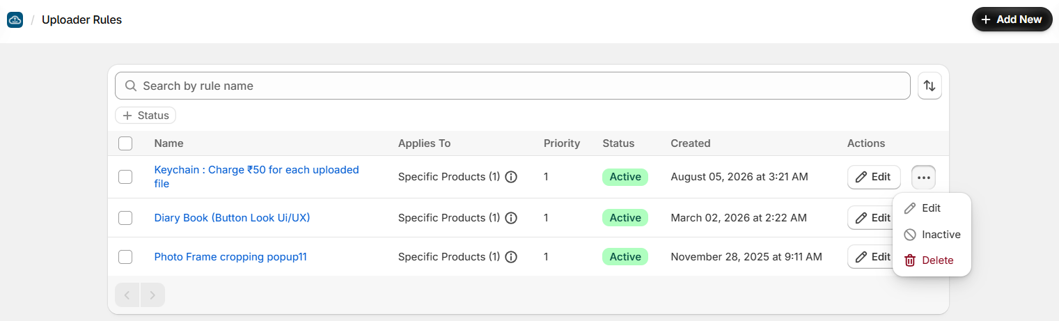
Uploader Rules Grid
The Uploader Rules section allows you to create and manage rules that control where file upload fields appear in your Shopify store. You can apply rules to specific products and manage their status, priority, and settings from one place.
| Field | Description |
|---|---|
Add New | Create a new uploader rule and configure its settings. |
Search by Rule Name | Find a specific rule by entering its name in the search field. |
Status Filter | Filter rules by their status to find active or inactive rules. |
Name | Displays the name of each uploader rule. Click the rule name to access its configuration. |
Applies To | Shows which products the rule applies to, such as specific products. The number indicates how many products are included in the rule. |
Priority | Displays the rule's priority order. |
Status | Shows whether the rule is Active or Inactive . |
Created | Displays the date and time when the rule was created. |
Edit | Open an existing rule to view or update its settings. |
More Actions (⋯) | Provides additional actions for managing a rule:
|
- Active rules: Rules marked as Active are enabled. The products and conditions they affect depend on each rule's configuration.
- Inactive rules: Deactivate a rule when you no longer want it to remain active.
- Priority: Use the priority setting to organize rules according to your app's rule-processing behavior.
- Delete: Deleting a rule removes it from the rule list. Make sure you no longer need it before deleting.
Rule Settings
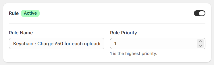
The Rule Settings section allows you to configure the name, priority, and status of an uploader rule. These settings help you identify and manage rules for your file upload fields.
| Field | Type | Description |
|---|---|---|
Rule Status | Toggle | Enable or disable the rule using the toggle. The status indicator shows whether the rule is Active. |
Rule Name | Text | Enter a descriptive name for the rule so you can easily identify its purpose. For example, Keychain: Charge ₹50 for Each Uploaded File. |
Rule Priority | Number | Set the priority of the rule. A priority of 1 is the highest priority. Use priority values to organize rules according to their importance. |
Applies To
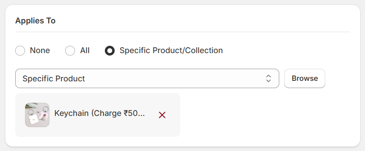
The Applies To section allows you to choose which products or collections an uploader rule applies to. You can apply a rule to all products, specific products or collections, or choose None if you do not want to assign the rule to any products or collections.
| Field | Description |
|---|---|
None | Select this option if you do not want the rule to apply to any products or collections. |
All | Apply the rule to all products in your store. |
Specific Product/Collection | Apply the rule only to the products or collections you select. |
Specific Product / Collection Selector | Choose whether to target a specific product or a collection. |
Browse | Click this button to browse and select the products or collections to which the rule should apply. |
Selected Products or Collections | Displays the products or collections currently selected for the rule. Click the remove icon (×) to remove a selected item. |
Enable Upload Field
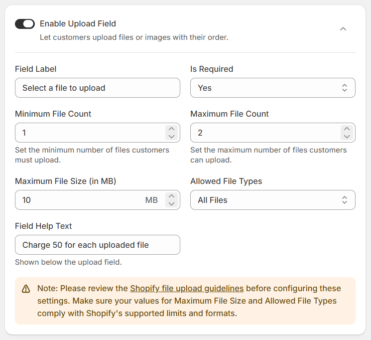
The Enable Upload Field section allows you to configure the file upload field displayed on your Shopify product pages. You can customize the field label, make uploads mandatory, set file count and size limits, restrict allowed file types, and provide helpful instructions for customers.
| Field | Type | Description |
|---|---|---|
Enable Upload Field | Toggle | Turn the toggle on or off to enable or disable the upload field for the rule. |
Field Label | Text | Enter the label displayed above the upload field on your storefront. For example, Select a file to upload. |
Is Required | Toggle | Choose whether customers must upload a file before proceeding with their order. |
Minimum File Count | Number | Set the minimum number of files customers must upload. |
Maximum File Count | Number | Set the maximum number of files customers can upload. |
Maximum File Size (in MB) | Number | Specify the maximum allowed size for each uploaded file in megabytes. |
Allowed File Types | Select | Choose which types of files customers can upload:
|
Field Help Text | Text | Enter additional instructions displayed below the upload field. For example, Charge 50 for each uploaded file. |
Enable Note Field
The Enable Note Field section allows customers to add custom notes or instructions along with their file uploads. These notes can provide additional information to help you understand and process the uploaded files correctly.
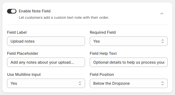
| Field | Type | Description |
|---|---|---|
Enable Note Field | Toggle | Turn the toggle on or off to enable or disable the note field for the uploader rule. |
Field Label | Text | Enter the label displayed above the note field. For example, Upload notes. |
Required Field | Toggle | Choose whether customers must enter a note before proceeding with their order. |
Field Placeholder | Text | Enter placeholder text displayed inside the note field to guide customers. For example, Add any notes about your upload.... |
Field Help Text | Text | Add additional instructions or information to help customers understand what details to provide. For example, Optional details to help us process your file correctly. |
Use Multiline Input | Toggle | Choose whether customers can enter text in a multiline text area or a single-line input. |
Field Position | Select | Choose where the note field appears in relation to the file upload dropzone:
|
Appearance
Upload Style
The Upload Style section allows you to choose how the file upload field appears on your Shopify product page. You can select a large drag-and-drop area or a compact upload button, depending on your store's layout and requirements.
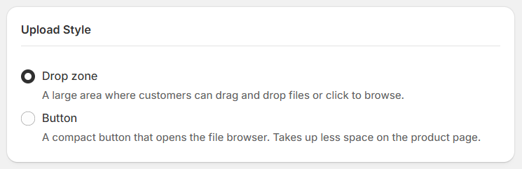
- Dropzone: Displays a large upload area where customers can drag and drop files or click to browse and select files. This option provides a clear and visible upload area on the product page.
- Button: Displays a compact button that opens the file browser when clicked. This option takes up less space on the product page.
Dropzone Text Styling
The Dropzone Text Styling section allows you to customize the appearance of the primary and secondary text displayed inside the file upload dropzone. You can adjust the text content, color, font size, and font weight to match your store's design.
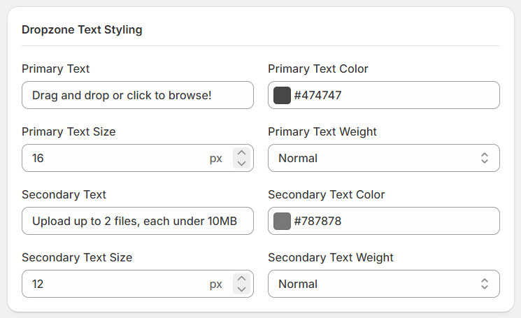
| Field | Type | Description |
|---|---|---|
Primary Text | Text | Enter the main message displayed inside the dropzone. For example, Drag and drop or click to browse!. |
Primary Text Color | Color | Set the color of the primary text using the color picker or a HEX color value. |
Primary Text Size | Number | Set the primary text font size in pixels (px). |
Primary Text Weight | Select | Choose the font weight for the primary text, such as Normal or other available options. |
Secondary Text | Text | Enter additional information displayed below the primary text. For example, Upload up to 2 files, each under 10MB. |
Secondary Text Color | Color | Set the color of the secondary text using the color picker or a HEX color value. |
Secondary Text Size | Number | Set the secondary text font size in pixels (px). |
Secondary Text Weight | Select | Choose the font weight for the secondary text, such as Normal or other available options. |
Dropzone Box Styling
The Dropzone Box Styling section allows you to customize the appearance of the file upload dropzone on your Shopify storefront. You can adjust the background colors, border colors, hover effects, shadow, corner radius, padding, and vertical spacing to match your store's design.
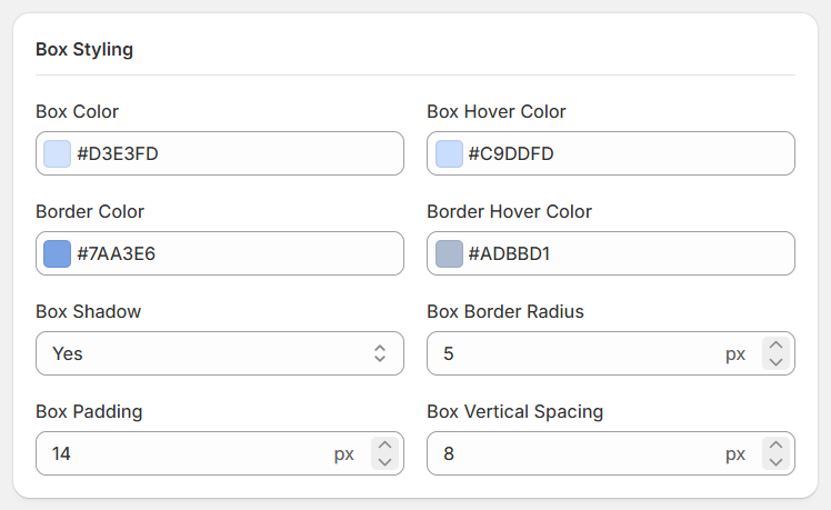
| Field | Type | Description |
|---|---|---|
Box Color | Color | Set the default background color of the upload dropzone using the color picker or a HEX color value. |
Box Hover Color | Color | Set the background color displayed when customers hover over the dropzone. |
Border Color | Color | Set the default border color of the dropzone. |
Border Hover Color | Color | Set the border color displayed when customers hover over the dropzone. |
Box Shadow | Toggle | Choose whether to display a shadow around the dropzone. |
Box Border Radius | Number | Set the roundness of the dropzone's corners in pixels (px). |
Box Padding | Number | Set the inner spacing between the dropzone's border and its content in pixels (px). |
Box Vertical Spacing | Number | Set the vertical spacing around the dropzone in pixels (px). |
Dropzone Show Icon
The Dropzone Show Icon setting allows you to display an icon inside the file upload dropzone on your Shopify storefront. You can choose the icon, adjust its position and size, and customize its color to match your store's design.
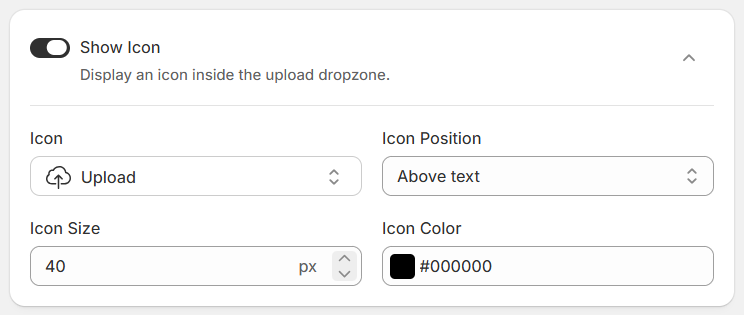
| Field | Type | Description |
|---|---|---|
Show Icon | Toggle | Enable or disable the display of an icon inside the upload dropzone. |
Icon | Select | Select the icon you want to display in the dropzone, such as the Upload icon. |
Icon Position | Select | Choose where the icon appears in relation to the dropzone text:
|
Icon Size | Number | Set the icon size in pixels (px). |
Icon Color | Color | Set the icon color using the color picker or a HEX color value. |
Button Text Styling
Customize the text displayed on the upload button to match your store’s design. Adjust the button label, font size, text colors, and font weight to create a consistent experience for your customers.
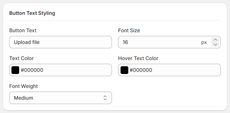
| Field | Type | Description |
|---|---|---|
Button Text | Text | Set the text displayed on the upload button. The default text is "Upload file." |
Font Size | Number | Set the button text size in pixels (px) to control readability and appearance. |
Text Color | Color | Choose the text color for the button's default state. |
Hover Text Color | Color | Choose the text color displayed when a customer hovers over the button. |
Font Weight | Select | Set the text thickness, such as Normal, Medium, or Bold, depending on the available options. |
Button Styling
Customize the appearance and layout of the upload button — width, alignment, size, colors, border, and corner radius — to match your store's design.
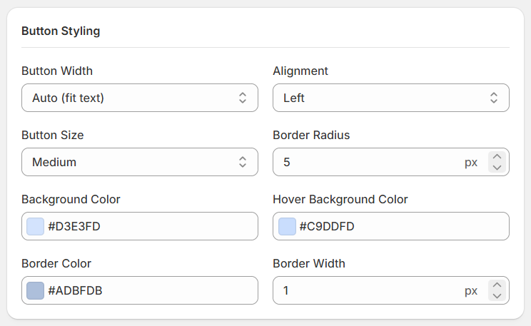
| Field | Type | Description |
|---|---|---|
Button Width | Select | Choose the width of the upload button, such as Auto (fit text) or other available width options. |
Alignment | Select | Set the button's alignment within the upload dropzone, such as Left, Center, or Right. |
Button Size | Select | Select the button size to control its overall appearance, such as Small, Medium, or other available sizes. |
Border Radius | Number | Set the roundness of the button's corners in pixels (px). |
Background Color | Color | Set the default background color of the upload button using a color picker or HEX color value. |
Hover Background Color | Color | Set the background color displayed when customers hover over the upload button. |
Border Color | Color | Set the color of the upload button's border. |
Border Width | Number | Set the thickness of the upload button's border in pixels (px). |
Show Icon
Customize the icon displayed inside the upload button to make it easier for customers to identify the upload action. You can enable or disable the icon, choose an icon, adjust its position, and customize its size and color.
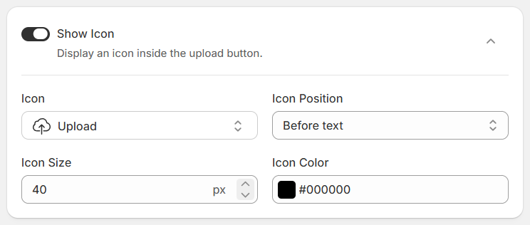
| Field | Type | Description |
|---|---|---|
Show Icon | Toggle | Enable this option to display an icon inside the upload button. Disable it to hide the icon. |
Icon | Select | Select the icon you want to display inside the button. The available options depend on the icons supported by the app. |
Icon Position | Select | Choose where the icon appears relative to the button text:
|
Icon Size | Number | Set the icon size in pixels (px) to control its visual prominence. |
Icon Color | Color | Choose the color of the icon to match your store’s design. |
Label Styling
Customize the appearance of the upload field label to match your store’s design. Adjust the label color, font size, and font weight to ensure the label is clear and easy for customers to read.
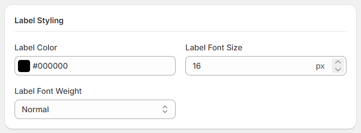
| Field | Type | Description |
|---|---|---|
Label Color | Color | Choose the text color for the upload field label. |
Label Font Size | Number | Set the label's font size in pixels (px) to control its readability. |
Label Font Weight | Select | Choose the thickness of the label text, such as Normal, Medium, or Bold, depending on the available options. |
Help Text Styling
Customize the appearance of the help text displayed below the upload field. Adjust the text color, font size, and font weight to make additional instructions easy to read while keeping them visually distinct from the field label.
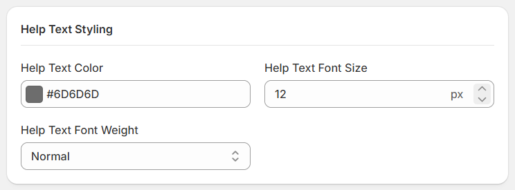
| Field | Type | Description |
|---|---|---|
Help Text Color | Color | Choose the text color for the help text displayed below the upload field. |
Help Text Font Size | Number | Set the help text size in pixels (px) to control its readability. |
Help Text Font Weight | Select | Choose the thickness of the help text, such as Normal, Medium, or Bold, depending on the available options. |
Advanced Settings
The Add Price to Uploads feature allows you to charge customers an additional amount when they upload files through the upload field on your storefront. The additional charge is added to the product's price in the cart.
Add price to uploads
Enable Add price to uploads to configure upload pricing. You can choose from three pricing types: Flat Rate, Per File, and File Count Range.
Enable Add Price to Uploads
Turn on this setting to charge customers an additional amount for their uploads. Turn it off if you do not want to apply an extra upload charge.
Price Type
Choose how the additional upload charge is calculated.
Flat Rate
Charge a fixed amount when a customer uploads at least one file, regardless of how many files they upload.
- Price: Enter the fixed amount to charge.
- The charge applies when the customer uploads one or more files, regardless of the total number of uploaded files.
Example: If the price is ₹10, the customer is charged ₹10 whether they upload one file or multiple files.
Per File
Charge customers for each file they upload.
- Price per File: Enter the amount to charge for each uploaded file.
- The charge is multiplied by the number of files uploaded.
Example: If the price per file is ₹10 and the customer uploads 3 files, the additional charge is ₹30.
File Count Range
Set different prices based on the number of files a customer uploads. You can create multiple ranges to apply different charges to different upload quantities.
- Min files: Enter the minimum number of files for the range.
- Max files: Enter the maximum number of files for the range. Leave the maximum blank for the final range if there is no upper limit.
- Price: Enter the charge for that file-count range.
- Add range: Click this button to add another pricing range.
- Use the delete icon to remove a range you no longer need.
Each range starts immediately after the previous range ends. Configure your ranges in order to cover the intended file counts without gaps or overlaps.
Example:
| Number of uploaded files | Additional charge |
|---|---|
| 1–2 files | ₹10 |
| 3–5 files | ₹20 |
| 6 or more files | ₹30 |
One-Time Charge
Enable One-time charge to charge once per cart line instead of charging separately for every product unit.
When this setting is disabled, the upload charge is applied for each product unit. For example, if the customer purchases 3 units, the charge may be applied 3 times.
When enabled, the charge is applied only once per cart line, regardless of the product quantity.
Image Cropping
The Image Cropping feature allows customers to crop their images before uploading them to your store. Enable this feature to let customers adjust their images according to your preferred cropping mode.
Enable Image Cropping
Turn on Enable Image Cropping to allow customers to crop images before uploading them. When enabled, you can choose the cropping mode that best suits your products.
Cropping Mode
Choose one of the following cropping modes:
| Mode | Description |
|---|---|
Allow free cropping | Allows customers to crop images freely without being restricted to a predefined aspect ratio. |
Allow circle-only cropping | Allows customers to crop images into a circular shape. Useful for keychains, badges, profile photo products, and other circular designs. |
Allow only specific ratios | Restricts customers to the aspect ratios you configure. You can add multiple cropping presets for different image formats or product requirements. |
When you select this mode, the following settings are available:
| Field | Description |
|---|---|
Label | Enter a name for each cropping preset, such as Landscape or Portrait. Customers can use these labels to identify the available cropping options. |
Ratio | Enter the aspect ratio for each preset, such as 16:9 for Landscape or 4:5 for Portrait. |
Add ratio | Click this button to add another cropping preset. |
Delete | Click the delete icon to remove a preset you no longer need. |
Example Configuration:
| Label | Ratio | Purpose |
|---|---|---|
| Landscape | 16:9 | Wide images and banners |
| Portrait | 4:5 | Portrait photos and product images |
| Square | 1:1 | Square product images and profile photos |
These are example presets. Configure the labels and ratios according to your product requirements.
Restrict Image Dimensions
You can set the minimum and maximum dimensions for image uploads.
| Field | Type | Description |
|---|---|---|
Restrict Image Dimensions | Toggle | Enable or disable image dimension restrictions for uploaded images. |
Min Width (px) | Number | Set the minimum allowed image width in pixels. Leave blank to skip the minimum width check. |
Max Width (px) | Number | Set the maximum allowed image width in pixels. Leave blank to skip the maximum width check. |
Min Height (px) | Number | Set the minimum allowed image height in pixels. Leave blank to skip the minimum height check. |
Max Height (px) | Number | Set the maximum allowed image height in pixels. Leave blank to skip the maximum height check. |
- Exact dimensions: Set the minimum and maximum values to the same number if you require an exact dimension. For example, set Min Width to 200 and Max Width to 200 to require a width of exactly 200 pixels.
- Minimum only: Set only the minimum value to require a minimum size without an upper limit.
- Maximum only: Set only the maximum value to enforce an upper size limit without a minimum.
- Independent checks: Width and height are checked independently, so you can restrict one dimension while leaving the other unrestricted.
Restrict Image Dimensions by Variant
Set different minimum and maximum image dimensions for individual product variants. This setting is useful when each variant requires a specific image size, such as different photo frame sizes or custom-printed products.
When enabled, variant-specific dimension limits override the general image dimension restrictions configured above. The available variants are based on the products selected in Applies To.
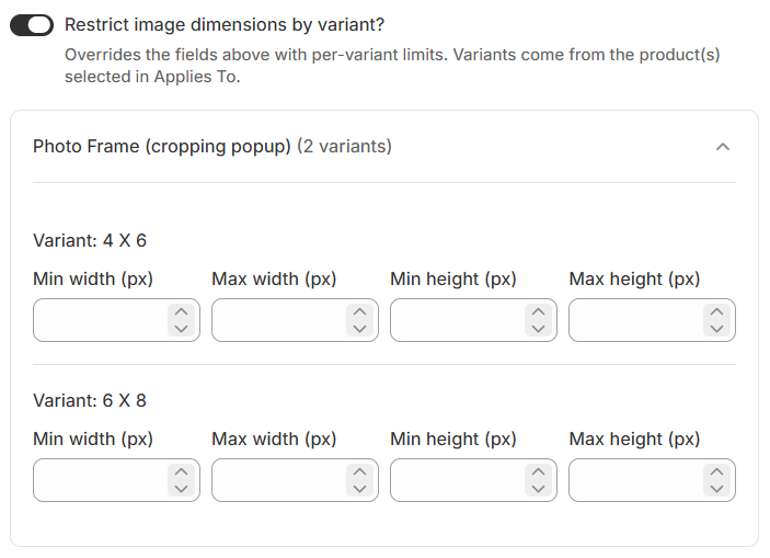
| Field | Type | Description |
|---|---|---|
Restrict Image Dimensions by Variant | Toggle | Enable this option to configure separate image dimension limits for each product variant. |
Variant | Display | Displays the product variant for which you are configuring image dimension restrictions. |
Min Width (px) | Number | Set the minimum allowed image width in pixels. |
Max Width (px) | Number | Set the maximum allowed image width in pixels. |
Min Height (px) | Number | Set the minimum allowed image height in pixels. |
Max Height (px) | Number | Set the maximum allowed image height in pixels. |
- Variant-specific limits override the general image dimension restrictions for the applicable variants.
- Only variants belonging to the products selected in Applies To are available for configuration.
- Width and height restrictions are evaluated independently.
- Leave a dimension field blank when no limit is required for that measurement.
- Configure appropriate limits for each variant to help customers upload images that meet your product requirements.
Additional Settings
If you want File Rename and use custom theme (for Element Selectors) then you can use Additional Settings.
Settings
Additional Placements
Use Additional Placements to display the file uploader in other sections of your Shopify store, beyond the standard product page. You can enable placements for the Featured Product section and Quick View, then add the app block in the appropriate location using the Shopify Theme Editor.
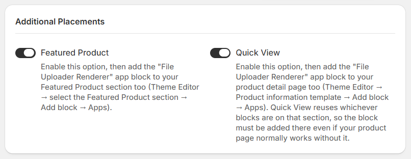
- Featured Product
Enable this option to allow the file uploader to appear in a Featured Product section on your storefront.
How to set it up:
- Enable theFeatured Product option in the app's Additional Settings.
- Open your Shopify Admin and go toOnline Store → Themes → Customize.
- Open the relevant page or template containing the Featured Product section.
- Select theFeatured Product section.
- ClickAdd block → Apps.
- Select theFile Uploader Renderer app block.
- Save your theme changes.
Once configured, the file uploader can appear in the Featured Product section.
- Quick View
Enable this option to allow the file uploader to appear in your theme's Quick View interface, where customers can view product details without navigating to the full product page.
How to set it up:
- Enable theQuick View option in the app's Additional Settings.
- Open your Shopify Admin and go toOnline Store → Themes → Customize.
- Open the product information template.
- Select the appropriate product information section.
- ClickAdd block → Apps.
- Select theFile Uploader Renderer app block.
- Save your theme changes.
Important: Quick View reuses the blocks configured for its product information section. Add the app block to that section even if the uploader already works on the regular product page.
- Enabling a placement in the app settings is only the first step; you must also add the File Uploader Renderer app block in the appropriate location in the Theme Editor.
- The uploader's visibility depends on the placement being enabled and the app block being configured in the relevant theme section.
- Theme layouts and Quick View implementations may vary, so the exact location of the relevant section can differ between themes.
File Rename on Download
The File Rename on Download feature allows you to automatically rename uploaded files when downloading them from the Uploaded Files section of the app. You can define a custom filename pattern using dynamic variables such as product name, variant, order number, quantity, and upload date.
This makes downloaded files easier to identify, organize, and associate with the correct product and order.
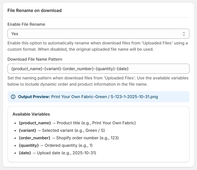
- Enable File Rename
Choose whether to enable automatic file renaming.- Yes: Automatically generates filenames using your configured naming pattern when downloading files from the Uploaded Files section.
- No: Keeps the original uploaded filename when downloading files.
- Download File Name Pattern
Enter a custom naming pattern using the available variables. These variables are replaced with the corresponding product, order, or upload information when the filename is generated.- Default pattern:
{product_name}-{variant}-{order_number}-{quantity}-{date}
- Default pattern:
- Output Preview
The Output Preview displays an example of the generated filename based on your configured pattern.- For example, using the default pattern:
Print Your Own Fabric-Green / S-S-123-1-2025-10-31.png
- For example, using the default pattern:
The preview helps you understand how the selected variables will appear in the downloaded filename.
Available Variables
| Variable | Description | Example |
|---|---|---|
{product_name} | Product title associated with the uploaded file. | Print Your Own Fabric |
{variant} | Selected product variant. | Green / S |
{order_number} | Shopify order number associated with the upload. | 123 |
{quantity} | Ordered product quantity. | 1 |
{date} | Upload date. | 2025-10-31 |
Element Selectors
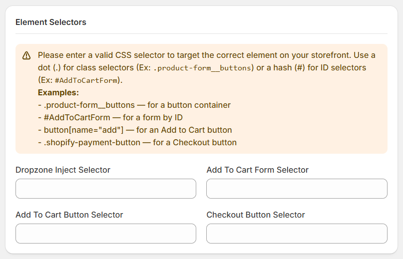
Element Selectors allow you to specify CSS selectors for important elements on your Shopify storefront. These selectors help the app identify where to display the file upload field and locate the product form, Add to Cart button, and Checkout button.
Use this setting when the app needs to target specific storefront elements, particularly when working with custom themes or layouts.
| Field | Description | Example |
|---|---|---|
Dropzone Inject Selector | CSS selector of the element where the file upload dropzone should be inserted on the product page. | .product-form__buttons |
Add To Cart Form Selector | CSS selector that identifies the product's Add to Cart form. | #AddToCartForm |
Add To Cart Button Selector | CSS selector for the Add to Cart button on the product page. | button[name="add"] |
Checkout Button Selector | CSS selector for the Checkout button on your storefront. | .shopify-payment-button |
Understanding CSS Selectors
A CSS selector identifies an HTML element on your storefront.
| Selector type | Description | Example |
|---|---|---|
Class (.) | Targets elements with a specified CSS class. | .product-form__buttons |
ID (#) | Targets an element with a specified ID. | #AddToCartForm |
Attribute ([]) | Targets elements based on an HTML attribute. | button[name="add"] |
File Storage
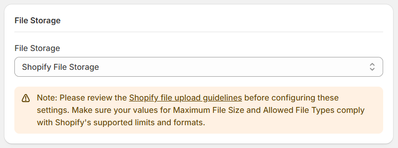
The File Storage settings let you choose where customer-uploaded files and images are stored. CI Upload – Files & Images supports Shopify File Storage and Dropbox.
Shopify File Storage
Select Shopify File Storage to use Shopify's file storage for customer uploads.
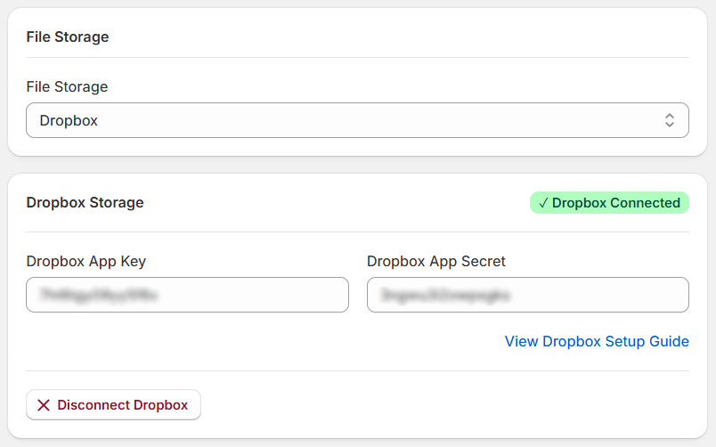
Dropbox Storage
Select Dropbox if you want to connect your Dropbox account for file storage.
| Field | Description |
|---|---|
Dropbox App Key | Enter the app key associated with your Dropbox application. |
Dropbox App Secret | Enter the corresponding app secret. |
View Dropbox Setup Guide | Open the setup guide for instructions on configuring Dropbox. |
Dropbox Connected | Indicates that Dropbox is connected. |
Disconnect Dropbox | Disconnect the existing Dropbox connection when needed. |
Pricing
The Pricing settings let you control how upload charges are displayed on your Shopify product pages. You can choose whether upload charges update the displayed product price, show a pricing summary, and customize the appearance of pricing information.
Price Display
The Price Display section controls how upload charges and pricing information appear on the storefront.
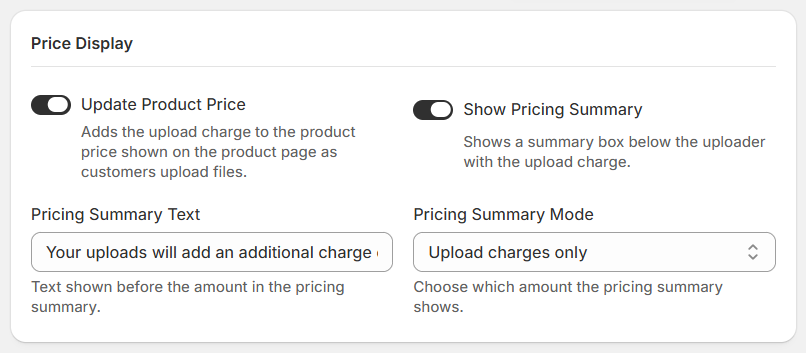
Update Product Price
Enable this option to add upload charges to the product price displayed on the product page as customers upload files.
- Enabled: The displayed product price is updated to include upload charges.
- Disabled: Upload charges are not added to the displayed product price through this setting.
Show Pricing Summary
Enter the text displayed before the amount in the pricing summary.
Example: Your uploads will add an additional charge of
Pricing Summary Mode
Choose which amount the pricing summary displays. Two options are available:
- Upload Charges Only: Displays only the additional charges associated with uploaded files.
- Product Price + Upload Charges: Displays the product price combined with the additional upload charges.
Pricing Appearance
Use these settings to customize the appearance of upload prices and the pricing summary box on your storefront.
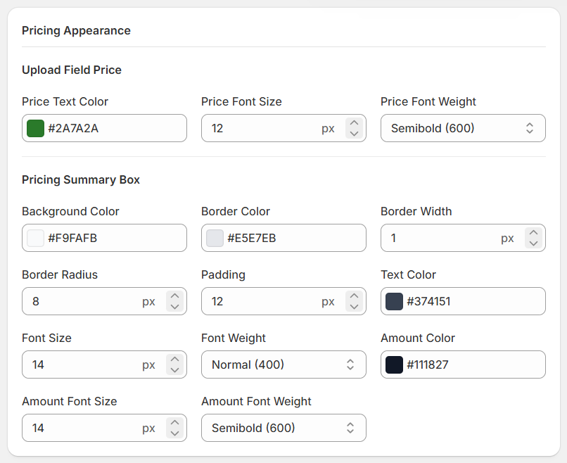
Upload Field Price
Customize the text displayed for the upload price.
| Field | Type | Description |
|---|---|---|
Price Text Color | Color | Set the color of the upload price text. |
Price Font Size | Number | Set the font size of the upload price. |
Price Font Weight | Select | Choose the font weight for the upload price text. |
Pricing Summary Box
Customize the design and typography of the pricing summary box.
Box Styling
| Field | Type | Description |
|---|---|---|
Background Color | Color | Set the background color of the summary box. |
Border Color | Color | Set the color of the box border. |
Border Width | Number | Set the thickness of the border in pixels. |
Border Radius | Number | Adjust the roundness of the box corners. |
Padding | Number | Set the spacing inside the box. |
Text Styling
| Field | Type | Description |
|---|---|---|
Text Color | Color | Set the color of the summary text. |
Font Size | Number | Set the font size of the summary text. |
Font Weight | Select | Choose the font weight of the summary text. |
Amount Styling
| Field | Type | Description |
|---|---|---|
Amount Color | Color | Set the color of the displayed amount. |
Amount Font Size | Number | Set the font size of the amount. |
Amount Font Weight | Select | Choose the font weight of the amount. |
Error Messages
The Error Messages settings let you customize the messages customers see when a file upload fails validation or an unexpected error occurs. You can tailor these messages to make errors easier to understand and help customers correct the problem.
File Validation Errors
These messages appear when an uploaded file or required field does not meet the configured requirements.
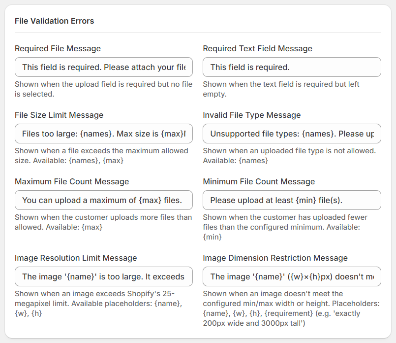
Required File Message
Displayed when the upload field is required but the customer has not selected a file.
Required Text Field Message
Displayed when a required text field is left empty.
File Size Limit Message
Displayed when a selected file exceeds the maximum allowed file size.
Available placeholder: {names}, {max}
- {names} — The name of the file that exceeds the size limit.
- {max} — The configured maximum file size.
Invalid File Type Message
Displayed when a customer selects a file type that is not allowed.
Available placeholder: {names}
- {names} — The name or names of the files with unsupported file types.
Maximum File Count Message
Displayed when a customer attempts to upload more files than the configured maximum.
Available placeholder: {max}
- {max} — The maximum number of files allowed.
Minimum File Count Message
Displayed when the customer uploads fewer files than the configured minimum.
Available placeholder: {min}
- {min} — The minimum number of files required.
Image Resolution Limit Message
Displayed when an image exceeds Shopify's 25-megapixel limit.
Available placeholder: {name}, {w}, {h}
- {name} — The name of the image.
- {w} — The image width.
- {h} — The image height.
Image Dimension Restriction Message
Displayed when an image does not meet the configured minimum or maximum width or height requirements.
Available placeholder: {name}, {w}, {h}, {requirement}
- {name} — The name of the image.
- {w} — The image width.
- {h} — The image height.
- {requirement} — A description of the required image dimensions, such as exactly 200px wide and 300px tall.
Upload Process Errors
These messages appear when a file upload fails or an unexpected error occurs during the upload process.
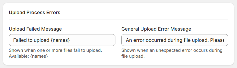
Upload Failed Message
Displayed when one or more files fail to upload.
Available placeholder: {names}
- {names} — The name or names of the files that failed to upload.
General Upload Error Message
Displayed when an unexpected error occurs during file upload.
Use this message to inform customers that the upload could not be completed and suggest that they try again.
Uploaded Files
View all files uploaded by your customers from here.
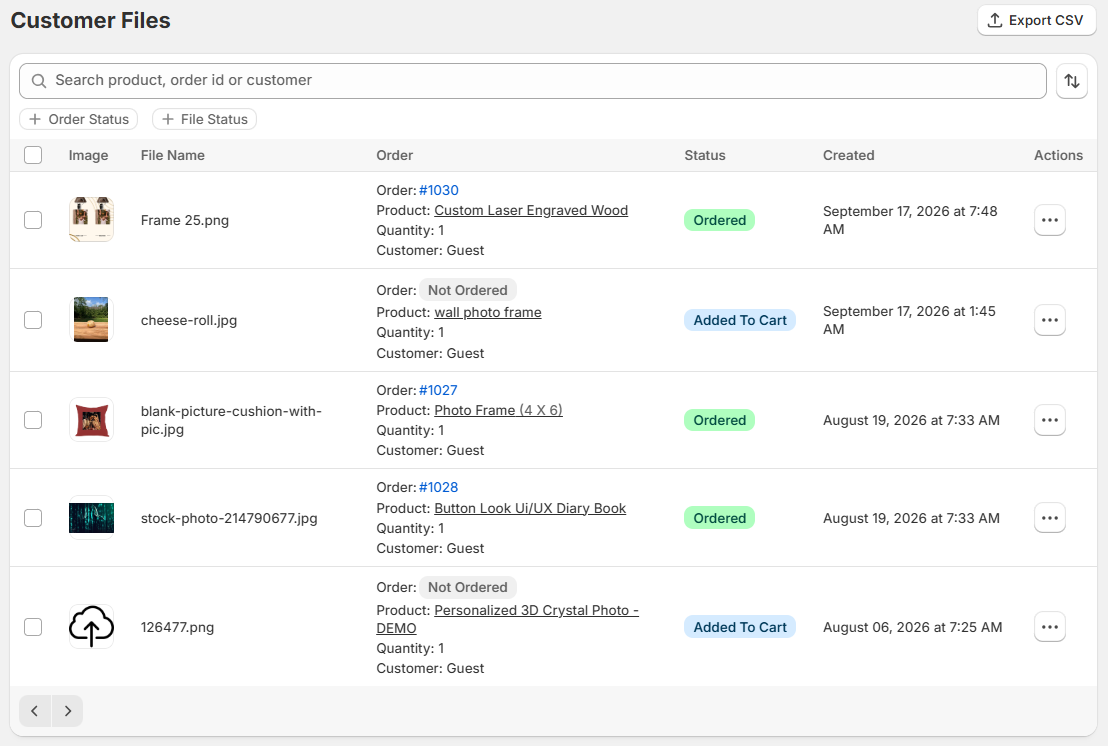
- Copy the file link or download files directly from here.
- Delete files you no longer need from here.
Applied on Frontend
Product Page
You can see the uploaded files preview in product page.

Mini Cart
You can see the uploaded files preview in the mini cart.

Shopping Cart
You can see the uploaded files preview in shopping cart before place the order.

Order Dashboard

Support
If this documentation doesn't answer your questions, please feel free to email us at info@cynoinfotech.com
Our support team operates in the GMT +5:30 time zone and responds to all inquiries within 12-24 hours on weekdays. In rare cases, the response time may extend to 48 hours, especially during the holidays, which may take longer..
Please don't forget to rate our app 5 stars ( ) on the App Store if you are satisfied with our app and customer support! Your feedback is greatly appreciated and helps us improve our services. Thank you!
Changelog
See what's new added, changed, fixed, improved or updated in the latest versions.
Version 1.2.2 Latest (30 September, 2026)
-
New
Version 1.2.1 (25 September, 2026)
-
New
Version 1.2.0 (17 September, 2026)
-
New
Version 1.1.3 (3 August, 2026)
-
New
Version 1.1.2 (7 July, 2026)
-
New
Version 1.1.1 (12 March, 2026)
-
New
Version 1.1.0 (28 January, 2026)
-
New
Version 1.0.2 (1 November, 2025)
-
New
Version 1.0.1 (27 August, 2025)
-
New
Version 1.0.0 (6 May, 2025)
Initial Release